About Quick Eats
Quick Eats is an online marketplace application designed for Iowa state university students to order and pick up food from cafes, dining centers, and marketplace with few clicks.
Project Summary:
Designed and created the Quick Eats website from scratch by creating a design system and logos, Developed test plans, user flows, user personas, architecture flow, and other design material during project development.
The Problem
40- 45 percent of university students experience food insecurity at the university. For students, this can mean increased stress and lower performance in their classes. Some of the reasons for food insecurity are Accessibility to food, Housing cost, Financial independence, and Rising Tuition.
Goal of the project
The goal of this project is to provide a design solution that helps university students to access food options easily anywhere on their campus and reduce food insecurities.
Target Users
Students attending Iowa State University
What is the biggest challenge?
The biggest challenge in this project was to quantify how much time students are actually wasting grabbing food. Also, to evaluate the feelings of students during lunch and breakfast hours while grabbing lunch or breakfast from the cafes food courts, and dining centers.
Design Process
Click on the image to move swiftly in different stages
Performed User Interview, Task analysis. Created User persona, User Journey
Created Mood Boards. Designed Low-fi diagrams. Performed Usability Testing.
Research
To perform our user research we performed user interviews with usability testing. Usability testing helped us to quantify data in terms of performance metrics. It also helped to validate the complains of students statements gathered during interviews
User Interview
To understand our food insecurity issues better, I conducted user interviews on 3Junior, 3Grad, and 2 staff members. After 8 interviews, it was evident that users are truly unsatisfied with the current system and looking for some innovative solutions.
Usability testing
To verify our interview data, I conducted a task analysis experiment. The participants were asked to time themselves when they were going to a particular café or dining center on a weekday. We calculated how much time it takes for participants to get food from different destinations.
Testing conclusion
From our testing, I found that users are spending 30 minutes reaching a place, eating, and getting back to the nearest cafe location which increases to 50 minutes during rush hour. Using this data, let’s create the fictional character, Roy, to understand our situation better.
Research Takeaways
Design Opportunities
Meet Roy- User Persona
Lets understand our situation better with the help of our user persona Roy. Roy is a sophomore. He has morning class, daytime lab session, and evening class to attend. He starts his day at 7 am. He uses University Café and dining center for daily meals.
Frustration:
Roy skips breakfast, as he doesn’t have time to wait in line during the morning hours. Waiting in the cafe line is really exhausting for Roy. After the rush hour, he finds it hard to find his favorite items as items go out of stock quickly.
Personality
#skilled #foodie #hangry
User Journey of Roy
To understand Roy better, we created his journey map on a regular day at the university. We used this map to point out the opportunities we can gather to explore. Our task is to understand Roy’s schedule in terms of breakfast, lunch, and dinner.
Conclusion
The journey of Roy shows that instead of focusing on his studies Roy spends half of his day worrying about food. This provides multiple opportunities to help Roy in getting his meals without struggle
Solution Iterations
After looking at multiple solution iterations, I found mobile-first design can bring some relief to the current problem.
Quick Eats Mobile App
Design an online marketplace that allows students and faculty to order food from university dining kitchens for delivery or pickup.
Application Benefits
Quick Delivery:
The app will use a data-driven approach to provide real-time updates of each location for food options, availability, and wait times to users.
Other Benefits:
The app will provide quick ways to order meals online with an accessible user interface.
Other Benefits:
Students can check nutrition info and allergy options to filter out options they don’t want to ea
How does the app work?
Once the user has ordered the food on the Quick Eats app, the app selects the nearest cafe or dining center for users to get their delivery or pickup in the quickest way possible. Based on their order, the app provides a list of optimal locations based on distance, waiting time, and availability. The user can choose the location from the list and can get their food delivered in the shortest amount of time.
Other Benefits
The application comes with extended benefits. Following are the benefits this app provides on top of its main purpose.
Create Employment Opportunities
The application creates on-campus job opportunities for students
Meal Share
The app helps students to send meal credits to other students on campus in need.
Regulates food distribution
The app regulates orders across all cafes/dining centers by checking real-time traffic
Ideation
During the Ideation phase, we created architecture diagrams and wire-frames for design iterations. Also, we performed usability testing with our lo-fi prototype and found issues to fix.
User flow structure
Wire-frames
On the basis of our User flow diagram, Wire-frame sketches were created.
On-boarding
Home
Delivery
Checkout
Usability Testing
I performed usability testing with 8 users. Users were provided 3 tasks in their testing. First, to create an account. Second, to order meals via delivery and pickup. Lastly, Users were asked to checkout using the most suitable options available.
Pros: Users loved the UI. They found it appealing to browse more.
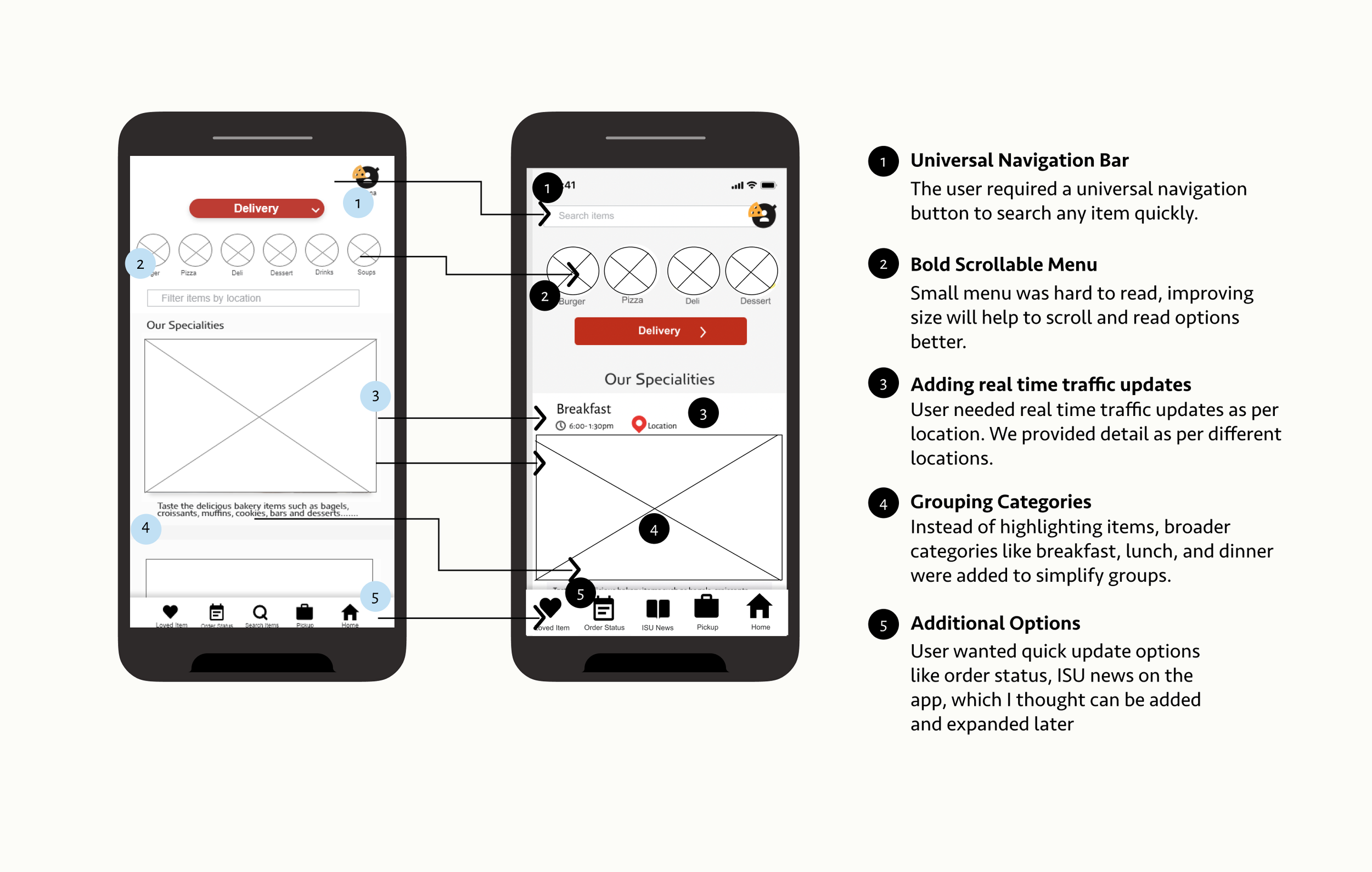
Cons: The users had some difficulties in selecting the scrollable menu. Also, users were confused with the category options provided in the menu. Another great feedback was to provide features looking for real-time traffic in a particular location at a particular time as compared to showing the overall traffic. Following were the changes made with User feedback.
Hi Fidelity Wire-frame
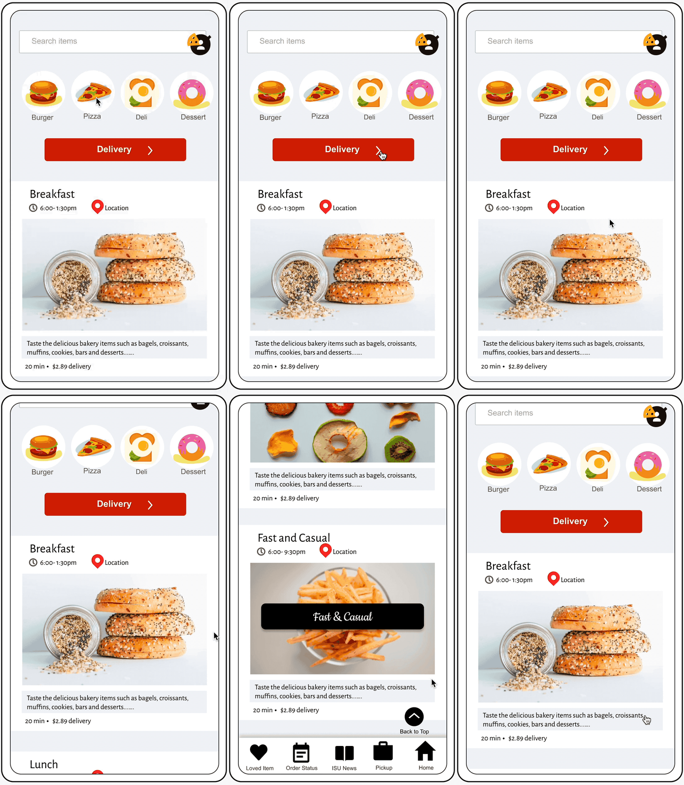
After Usability testing I worked on High Fidelity Wire-frames. Below screens shows Hi-fi wire frames sorted by categories.
Prototyping
Finally, a basic prototype was created along with solving some major questions related to the app. I went back to the major pain points which were identified during the research phase.
On-Boarding
Connects with University Account
Anyone with an Iowa state university id and password can log in to the portal. Although the app is specifically designed to help students, even professors or part-time workers with valid university IDs can enjoy its benefits.
Click the highlights !!!
Easy order placement
Exploring marketplace online
With quick eats, students can order their favorite cuisine online according to the time of the day. There are multiple ways to order from the app. Since university food remains the same all across the campus. Students can directly choose the food items and let AI decide which route will be the fastest, quickest, and cheapest to deliver.
Click the highlights !!!
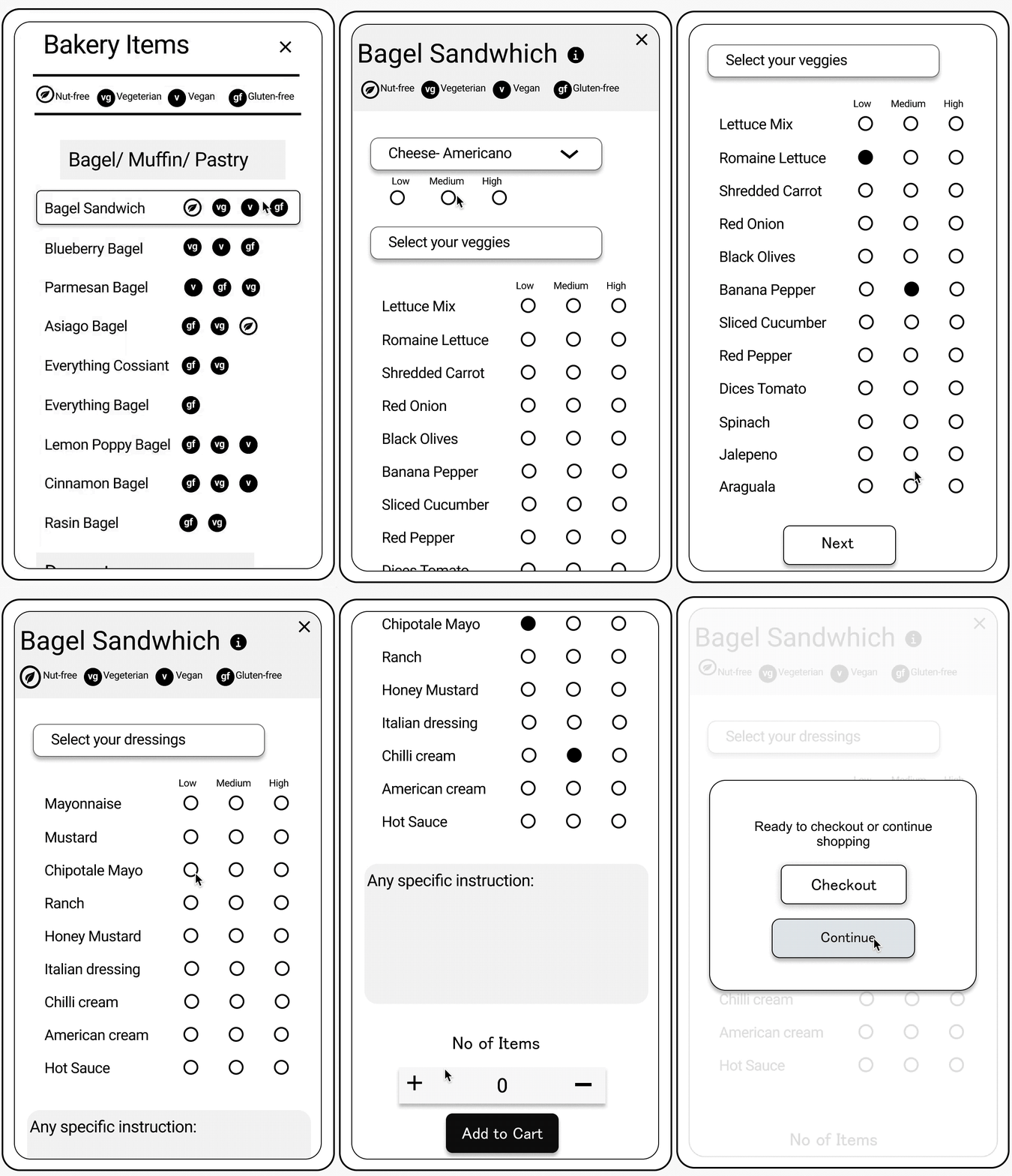
Order Menu
Customising order with Quick Eats
Students can customize orders or check menu nutrition info with a few clicks. This will help students quickly filter out options for ordering their favorite meals without a lot of hustle.
Click the highlights !!!
Delivery/ Pickup
Providing quicker ways to grab meals
With online orders, Students can choose quick delivery or pickup points for food pickup to get their meals delivered to the provided locations. This will help students to avoid waiting in lines during rush hours. Save commute time during lunch, and dinner hours.
Click the highlights !!!
Checkout Payment
Helping students organize their meals beforehand
Quick eats helps provide multiple ways to pay for meals and to organize when they want their food to be delivered. Students can pay for their meals by Credit card, Meal Passes, or University Cash Balance.
Students can order a meal as soon as the day starts and get it delivered during lunchtime. To accomplish this students are required to select the time and day they want their order to be delivered at the checkout.
Click the highlights !!!
Meal Share
Helping low-privileged kids not to starve due to low funds
Meal passes are the passes that students buy at the university every semester. One meal pass is equivalent to $10 which can be used at any dining center and cafe for buying meals. Sharing meal passes will help low-privileged kids to get free meals from the university.
Click the highlights !!!
Back of the house- graphics
We used the Iowa State University logo color for UI design. Since the app is specifically created for students, we wanted students to feel this app is part of the university. A clean, minimalist text style is used throughout the app to give a contemporary modern look.
Final Outcome
Students enjoyed using the application and provided some feedback to expand the application for other users like broadcasting University announcements, Providing general news feedback, etc.


